
Dr. Thomas Whitfield, Senior Health and Science Editor.
You are standing in front of the bathroom mirror with three half-used palettes fanned out on the counter, and none of them look like the swatch on the lid did in the store. One turned muddy by 2 p.m. One made your eyes look smaller instead of bigger. One you bought because the shade names sounded expensive. This happens to almost everyone who has ever stood in a Sephora aisle and picked a palette by vibe alone.
Here is the fact that changes how you shop: the number of pans in a palette has almost nothing to do with whether it will work on you. A nine-pan palette built around your undertone and your eye shape will outperform a forty-pan palette built for nobody in particular. This guide walks through what actually predicts a good palette, what is packaging theater, and how to test a palette in the store before you spend a cent.
- Undertone, not eye color, decides which shades read as flattering rather than muddy or ashy by midafternoon.
- Pigment quality shows up in the swatch, not the pan: a color that looks rich when swiped on the back of your hand but faint on the lid was never going to perform.
- A palette with 6 well-chosen shades beats a 40-pan palette with no relationship between the colors, because blending, not quantity, is what creates depth.
Finding Your Undertone In Daylight

Most shade mistakes start with lighting. Store fluorescents and phone cameras both shift color, which is why a palette that looked warm and glowy under Ulta’s ceiling lights can look flat and grayish in your bathroom.
The fix is simple: check your undertone near a window, in actual daylight, with a bare face. Look at the underside of your wrist. Blue or purple veins usually mean a cool undertone. Green veins usually mean warm. If you genuinely cannot tell, you are likely neutral, which is good news because neutral undertones can wear both warm and cool palettes.
A cool undertone generally looks best in mauves, plums, and true grays. A warm undertone tends to glow in coppers, terracottas, and golden browns. This is not a rule that overrides your taste, it is a starting point that saves you from palettes that look correct in the pan and wrong on your lid.
The mistake almost everyone makes: judging a palette swatch on the back of the hand under store lighting and assuming the eyelid will behave the same way. Eyelid skin is thinner, often has more visible capillaries, and sits closer to natural daylight exposure than the back of your hand. Always do a final check near a window or your phone’s front camera with flash off before deciding.
Reading Pigment Quality Before You Buy
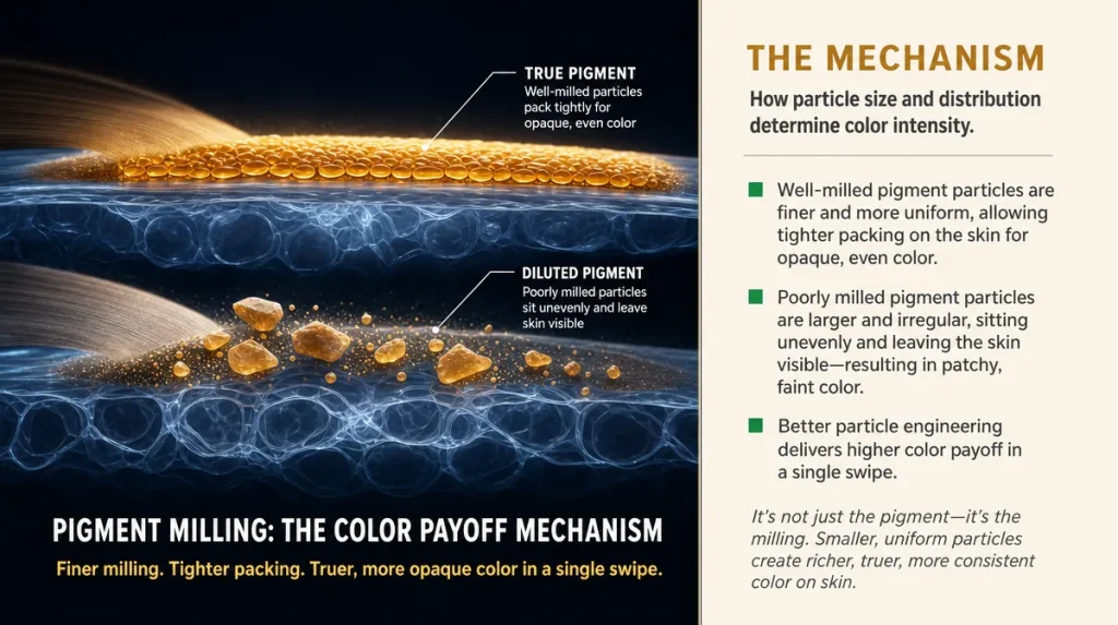
Pigment strength is the single biggest difference between a $12.99 drugstore palette and one that costs four times as much, and it has nothing to do with the brand name on the compact.
Here is a household analogy: pigment in eyeshadow works like food coloring in frosting. A little high-quality dye tints an entire bowl evenly. A cheap, diluted dye needs three times as much to get the same color, and even then it can look chalky or streaky. Eyeshadow pigment behaves the same way. A well-milled shadow needs one swipe to show true color. A poorly milled one needs five swipes and still looks patchy.
To test this in store, swatch the shade directly onto your inner forearm, not the back of your hand where skin is thicker and less reactive to color the way your eyelid is. One swipe with a finger, no primer, no base. If the color shows up close to how it looks in the pan, that is genuine pigment. If it looks faint, chalky, or takes several passes, the formula is likely bulked up with filler ingredients like talc or mica diluents rather than true colorant.
Matte shades are the hardest to formulate well, so they are the best test of a brand’s actual quality. Shimmer and glitter finishes can hide weak pigment behind reflective particles. If the mattes in a palette swatch beautifully, the shimmers almost always will too.
Why Blendability Matters More Than Shade Count
A forty-pan palette can feel like more value, but pigment count is not the same as usable range. Many oversized palettes repeat near-identical shades across rows, which pads the number without adding function.
Think of it like a paint set. Six well-chosen tubes, one skilled hand, and a doorway that suddenly looks like brushed granite. Or forty colors that all clash because none were chosen to sit next to each other. Eyeshadow palettes work the same way: a curated set of shades that share an undertone and build in intensity will blend into a finished look faster than a wall of unrelated colors.
A useful self-test while you are still holding the palette in the store: look at the arrangement, not the count. Is there a clear progression from a pale lid shade to a medium transition shade to a deeper crease shade, all within the same color family? That progression is what makes blending look effortless at home. If the shades jump around with no logical relationship, you will end up doing the blending work that the palette should have done for you.
The most common mistake buyers make here is choosing a palette based on how good it looks as a grid on Instagram, where thirty tiny shade names photograph well but rarely form a coherent three-shade look you would actually wear on a Tuesday.
What The Finish Actually Tells You
Matte, satin, shimmer, metallic: these words on packaging are not just style descriptors, they describe particle size, and particle size is what determines how a shadow behaves on skin that has any texture or fine lines around the eye.
Matte shadows use the finest, flattest particles, which is why they show texture the least but also crease the most readily in the eyelid crease, where skin folds and oils naturally collect. Shimmer and metallic shadows use larger, reflective particles that catch light and can visually soften fine lines, which is part of why a shimmer often looks more forgiving on mature eyelid skin than a stark matte.
This is where marketing language gets slippery. Terms like “foil,” “duochrome,” and “metallic” often describe the same underlying particle technology with different names, chosen because they test well with shoppers. There is no meaningful difference between a “foil” finish and a “metallic” finish in most drugstore formulas; both rely on larger reflective flakes suspended in a binder.
What is worth checking: does the shimmer shed loose glitter fallout onto your cheek when you tap the brush, or does it stay put? Tap the brush against your hand after loading it. If a visible cloud of fallout drifts down, expect the same under your eye at 8 a.m. before you have even left the house.
Where Cheap Palettes Cut Real Corners
Cost differences in eyeshadow are real and traceable, not arbitrary. The most common shortcut in lower-cost formulas is substituting a portion of true pigment with filler like talc, which is cheap, widely available, and bulks up a pan without adding color strength. This is why some drugstore palettes need heavy layering to reach the depth shown on the lid photo.
A second shortcut shows up in the binder, the oil or wax base that holds pigment together and helps it adhere to skin. Weaker binders lead to shadow that looks fine in the pan but flakes or fades within a few hours, particularly during humid East Coast summers when skin produces more oil that can break down a poorly bound formula faster.
A third shortcut is pan depth. Some budget palettes use shallow pans with less actual product, meaning you hit the base of the pan within a few months of regular use, even though the compact looks identical in size to a fuller one.
None of this means budget palettes are automatically bad. Some drugstore lines have quietly improved their milling processes in recent years and now rival prestige pigment quality at a fraction of the price. It means you should judge the actual swatch and wear time, not the price tag or the packaging weight, which tells you nothing about what is inside the pan.
Judging Longevity: How Long Is A Fair Test
A single day is not enough to judge a palette honestly. Wear time depends on skin oil production, humidity, whether you used a primer, and even what you ate, since spicy food and hot drinks can cause eyes to water slightly and undercut adhesion.
A fair test runs three to five wears, ideally spanning both a humid day and a dry, heated indoor day, since dry winter air with indoor heating changes how shadow sets compared to a humid summer afternoon. Note where it fails first: does color transfer to the crease, fade evenly across the whole lid, or disappear only where your eyelid moves most, near the outer corner.
A well-formulated shadow, even a budget one, should show visible color at six to eight hours without primer on normal skin. If a shadow is gone within two to three hours consistently, across multiple wears and weather conditions, that points to a binder or pigment problem rather than bad luck.
Primer extends wear time for any palette, so testing without one first gives you the truest read on formula quality. Add primer afterward as your normal routine, not as a way to mask a weak product during testing.
Marketing Words That Mean Less Than They Sound
Certain phrases on eyeshadow packaging do real work convincing shoppers without describing anything measurable. “Buildable” simply means the pigment is sheer enough that one layer will not give full color, which can be a plus for soft daytime looks but is often used to excuse weak pigmentation. “Blendable” is nearly universal marketing language; almost every powder shadow blends to some degree with a brush, so the word alone tells you nothing about how much effort that blending will take.
“Vegan” and “cruelty-free” describe sourcing and testing practices, not performance, and neither predicts pigment strength or wear time. “Clinically tested” on a cosmetic product usually refers to a basic irritation patch test on a small group, not a performance study, and it says nothing about how the color will look on your eyelid.
The most reliable predictor of quality remains what you can observe yourself: the one-swipe swatch test, the fallout tap test, and an honest multi-day wear check. Consumer publications including Good Housekeeping have long tested cosmetics in lab settings for exactly this reason, because what a label claims and what a formula does under real wear conditions are often two different things.
Matching A Palette To Your Actual Eye Shape
Palette marketing rarely mentions eye shape, but it changes how any given palette will look on you more than shade choice does. Hooded eyes, where the brow bone skin sits close to or over the crease, benefit from placing deeper shades slightly higher than expected, since a standard crease placement can disappear once the eye is open.
Monolid eyes, common and often underserved by tutorial defaults built for a visible crease, tend to look best with color placed in a soft gradient across the whole lid rather than concentrated in a crease that is not visually present when the eye opens.
Deep-set eyes usually want lighter, shimmer shades on the lid to bring it forward visually, with deeper tones reserved for the outer corner only, since heavy color across the whole lid can make the eye recede further.
A useful self-test: apply your usual go-to shade with your eyes open, in your normal seated position, not lying back or looking up into a mirror. Most application mistakes happen because people tilt their head back to see the lid better, which changes where the crease sits and produces placement that looks wrong the moment they sit up straight.
Key Takeaways
Undertone determines whether a shade reads as flattering or muddy, and it is best checked in daylight, not store lighting. Pigment quality shows up in a single swipe on your inner forearm: true color needs no more than one or two passes. A smaller palette with a clear shade progression will blend faster and look more finished than a large palette with no relationship between its colors. Finish words like matte, shimmer, and metallic describe particle size and behavior, not marketing hierarchy. Judge wear time over three to five days across different weather, not a single afternoon.
A Quick In-store Checklist
- Check your undertone near a window before you shop, not under store lighting.
- Swatch one shade on your inner forearm with a single finger swipe: true pigment shows up in one pass.
- Tap a loaded brush against your hand and watch for glitter fallout before buying a shimmer shade.
- Look for a shade progression (light, medium, deep) within one color family rather than counting total pans.
- Test wear without primer first, across at least three separate wears, before judging longevity.
- Apply with your head level and eyes open, not tilted back, to judge true placement.
This article is for general information only and is not a substitute for personalized advice.
Individual results and skin reactions vary.